
· By Talia Bromstad
Custom Printing Spotlight: Alice Serres
Alice Serres is an Atlanta-based painter and mixed media artist making colorful work with dreamy, surreal, abstract landscapes. We met last year at an art opening and I was excited when they reached out last month about transforming one of their art pieces into a risograph print.
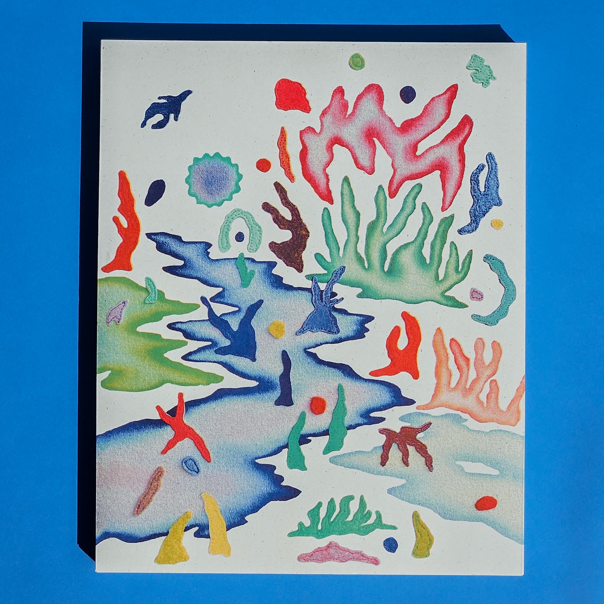
The challenge with Alice's work was to translate tons of color and texture into its own special print that was more than a simple reproduction. The original work featured felt, leather, and paint on a flecked, natural-colored canvas.

A traditional giclée art print would use ink-jet printing to achieve a picture-perfect likeness of the original art, including the color and texture of the canvas. But we wanted something more unique. So together, Alice and I decided on a four-color palette to best translate the original colors, and a warm, off-white flecked paper stock that would become the new canvas.
Working with an image of the original artwork, I carefully lifted the color and shapes from the canvas in Photoshop to prepare for making color separations. I also worked a little magic to fabricate extra bits of the colorful shapes that bleed off the left and right sides of the image so that the proportions of the final piece would allow for enough room to trim down. The original painting had already been sold so we couldn't rephotograph it to get those bits in there.

One of my favorite programs is Spectrolite, which is a really great tool for visualizing and generating riso-specific ink color separations. Once the shapes had been isolated, I ran the resulting image through Spectrolite to help generate my color separations in federal blue, seafoam, bright red, and sunflower yellow.

On the left above is the edited original image. You can see in the resulting "riso-fied" image on the right that original bright blues were toned down to my more muted federal blue ink. We also lost a little of the vibrant purple, which Specrolite rendered as a more solid blue. But by layering the four ink colors, many of the original colors are maintained. The new colors give the image their own personality already.
Every risograph printer knows their machine's quirks and tendencies, so I knew the separation work wasn't quite finished. With the generated separations, I went back in and tweaked and edited different areas that I knew wouldn't print exactly as shown. Some of the very light colors would need a little boost, and some other areas needed to be toned down.
Once everything looked good, it was off to print.
My riso machine prints two colors at a time, so we'd be running our sheet through twice to achieve the four-color print.
 First up was yellow and seafoam. I chose these two because they would put the least amount of ink on the center 1" of the page. The order in which colors are printed is important because the rollers that grab the sheet can smudge ink already on the page if it hasn't dried down enough or if the image has a high density of ink.
After about 24 hours of dry time, I loaded the pages back into the risograph machine for the next layer: federal blue and bright red. Going from two to four colors was when the magic really happened, and I realized this print was going to be phenomenal.

The final step of this project, after letting the second layer dry for another day, was to trim down to the final size of 8"x10". Read more about my antique paper guillotine here.
To say this print turned out better than I imagined is an understatement. The way the flecked paper becomes the new canvas is so satisfying, and the color combination we chose was spot on. The original colors were so nuanced and varied, and while the riso inks put a limit on that, they also made the shapes pop and compliment on another in a totally new way.

The tiny stitching details and fuzzy felt texture of the shapes in the original work are delightful to behold in risograph form. Up close there is a little bit of misregistration visible, but that's part of the charm of the process, as I like to remind my clients.

You don't get these tiny imperfections in a giclée print. You don't get the fabulous, saturated colors either.
If you are an artist looking for a way to offer prints of original work that are more unique and exciting and a simple reproduction, risograph may be for you! Learn more about the custom printing process here. There is a certain amount of control that must be relinquished in the process, but the results, unpredictable as they may be, can be stunning.

Follow Alice on Instagram. You can visit their website to purchase the print, or shop in person at Community Market Atlanta on May 14, 2023 at WildHeaven Brewery West End.