


· By Talia Bromstad
Custom Printing Spotlight: Emma Freymann
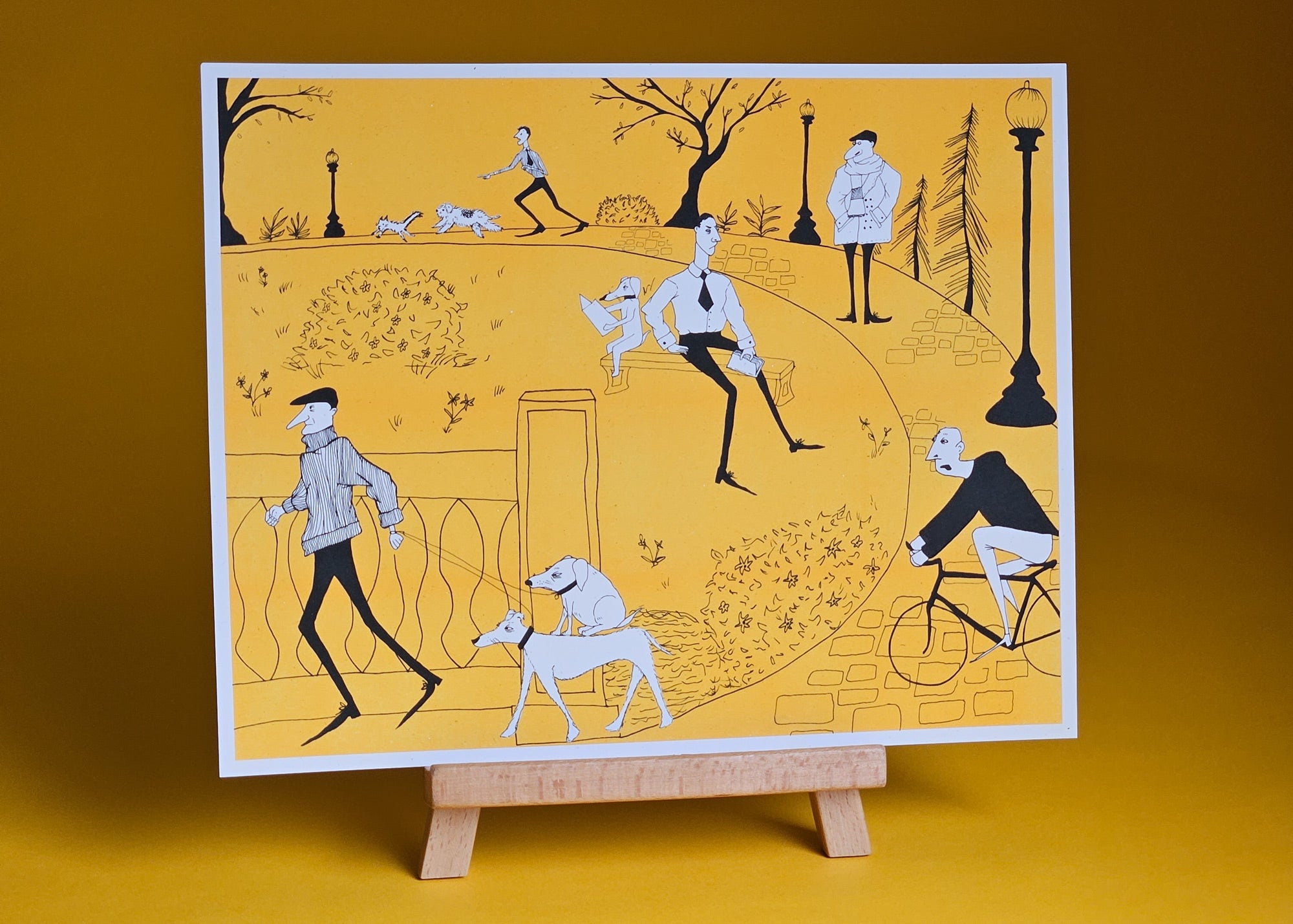
 Take a stroll through Rittenhouse Square Park! Had the delightful opportunity to print this piece for illustrator Emma Freymann last month. We risograph printed this bold, high-contrast illustraion in two colors, sunflower yellow and black on an 80lb cover weight fiber-flecked paper called Cottonwood.
I love Emma's use of black linework combined with blocks of bright color and pops of white. It really makes use of the paper as its own color instead of just a background to be covered up. And her separations were perfect!

Above, you can see the black separation on the left, and the yellow separation on the right. In these grayscale images, 100% black means all the ink prints, and 100% white means no ink prints. Notice how in the right separation for the yellow layer, the only white areas are where true paper white will show.
In a print like this, the linework can be tricky. A mistake I see often is to have the linework knocked out of the color block layer. Meaning wherever the linework sits, there is corresponding paper-white linework showing on the color block layer. This is OK if it's a digital image that never moves, but...
The issue in risograph printing is that misregistration is part and parcel of the process. So when the black layer shifts ever so slightly during printing (and it WILL shift ever so slightly...) you would see white lines show in the yellow layer.
 Best practice is to overprint the yellow or color block layer wherever there are skinny lines on top. Meaning, don't knock out your linework!
 The same goes for the bigger areas of black in this illustration too, just to make this consistent. Go ahead and plan to overprint the color block layer to eliminate misregistration showing on the edges of these areas.
Now, the only time you WOULDN'T want to overprint the colorblock layer is if you are planning on using two lighter ink colors where layering them may create a third color you don't want in the print. Layering and overprinting is more of an artistic choice in this scenario.
You may consider adding trapping instead of overprinting completely, but if you dig the misregistration, then you probably can't be bothered, haha.
 I'm looking forward to printing more of Emma's work in risograph form! If you are interested in having risograph prints made of your own work, don't hesitate to get in touch. Shoot me an email at info@bromstadprinting.co to get started today.
See Emma's work on Instagram @thesluglady.